Interface Guide
Perigma has a responsive interface designed for desktop apps, mobile devices, and web browsers. In this guide, you will learn the main interface components and how to use them.
Desktop Interface
On desktop apps and in the web browser (app.perigma.com), Perigma has three main areas:
1. Left Sidebar
The navigation menu on the left lists all sections available for your role. Main groups include:
- Mine (Student/Guardian): Personal operations
- Overview (Management): Dashboard
- People: Students, guardians, staff
- Academic: Courses and groups
- Operations: Attendance, planning, assignments, exams
- Cafeteria: Cafeteria management
- Communication: Announcements and SMS
- Finance: Contracts and payments
- Institution: Institution configuration
- Account: Profile settings
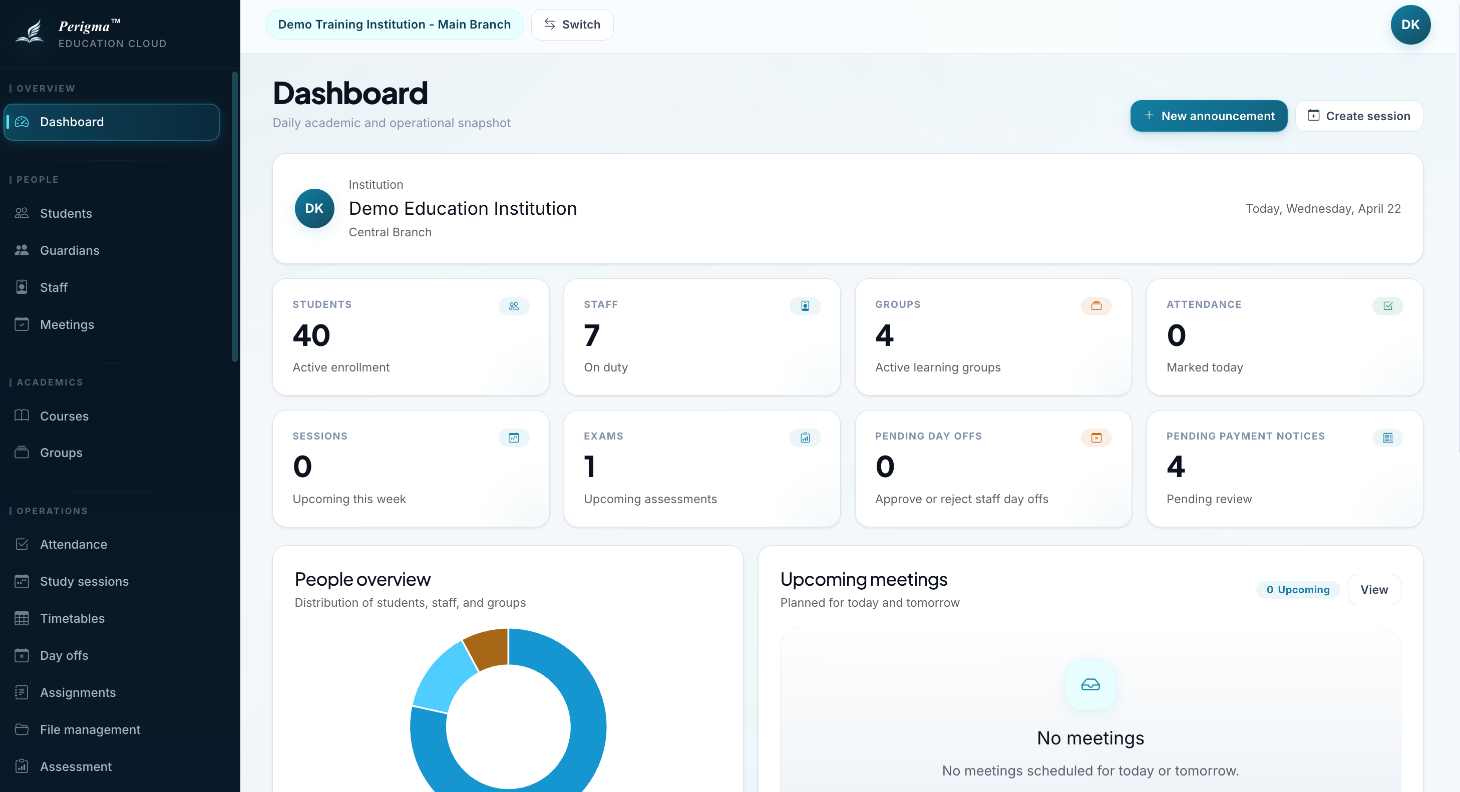
Image 1: Desktop layout - left menu, top bar, content area
2. Top Bar
The top bar includes:
| Item | Description |
|---|---|
| Institution Name | Shows your active institution |
| Profile Avatar | Your photo or initials; opens profile menu |
3. Main Content Area
The selected page content is displayed here. Most pages include:
- Page title and description
- Action buttons (create new record, filter, etc.)
- List or detail views
Web Interface
You can access Perigma's web version at app.perigma.com using any modern browser. The web interface provides the same experience as the desktop app:
- No installation required — open your browser and start using it right away
- The same left sidebar, top bar, and main content area as the desktop app
- When you resize the browser window, the interface automatically switches to the mobile layout
- Your session is stored securely in the browser; you do not need to log in again after refreshing the page
Bookmark app.perigma.com in your browser for one-click access to Perigma.
Mobile Interface
On mobile devices, the interface is optimized for smaller screens.
Bottom Navigation
At the bottom, role-based 5 quick shortcuts are shown:
For Student/Guardian:
| Icon | Page |
|---|---|
| Home | Home |
| Assignments | Assignments |
| Attendance | Attendance |
| Payments | Payments |
| More | More |
For Management Roles:
| Icon | Page |
|---|---|
| Dashboard | Dashboard |
| Students | Students |
| Attendance | Attendance |
| Assignments | Assignments |
| More | More |
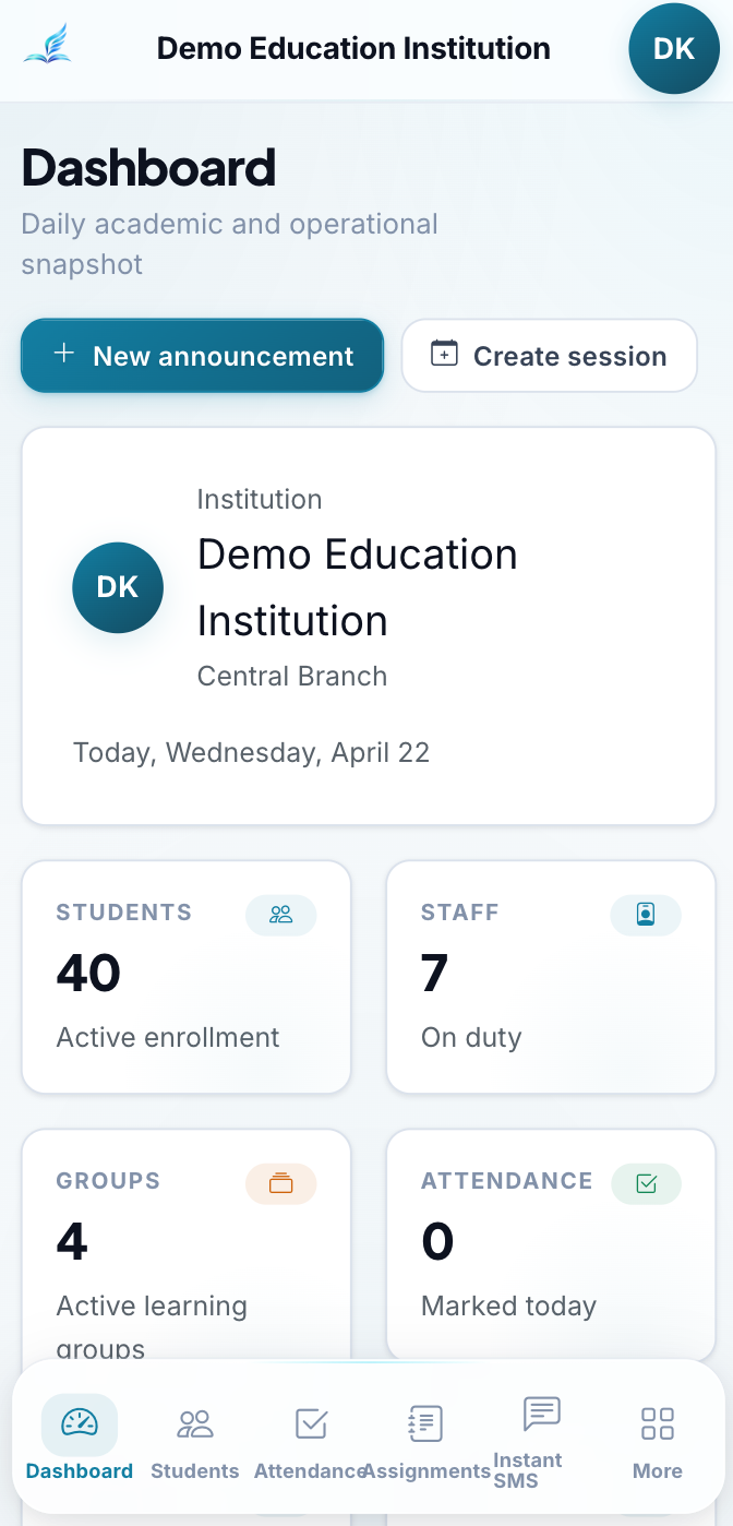
Image 2: Mobile interface with bottom navigation
More Menu
When you tap "More", an extended menu opens with all available sections. App version information is also displayed in this area.
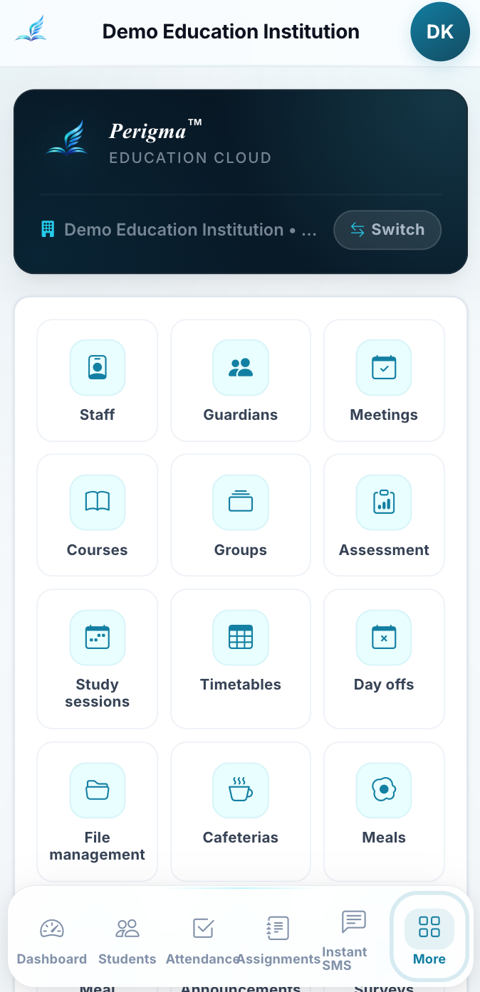
Image 3: "More" menu with all accessible sections
Shared Interface Components
Page Header
Each page header contains the page name, a short description, and action buttons (for example, "Add New Student").
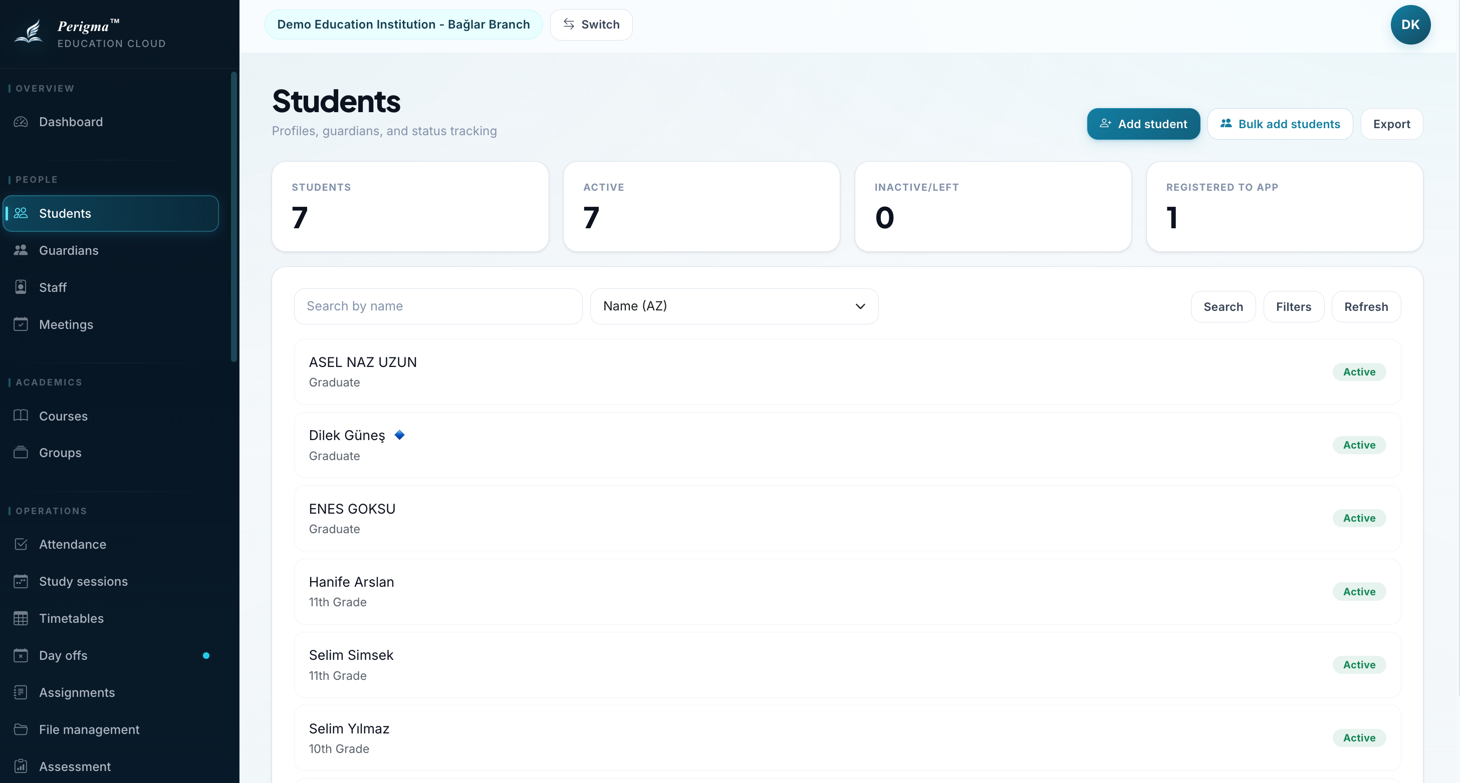
Image 4: Example page header with title and actions
Lists and Table View
On list pages (students, assignments, exams), data is shown in table format:
- Use pagination controls to move between pages
- By default, 20 records are shown per page
Empty State Screen
Pages without records display an informational empty state message.
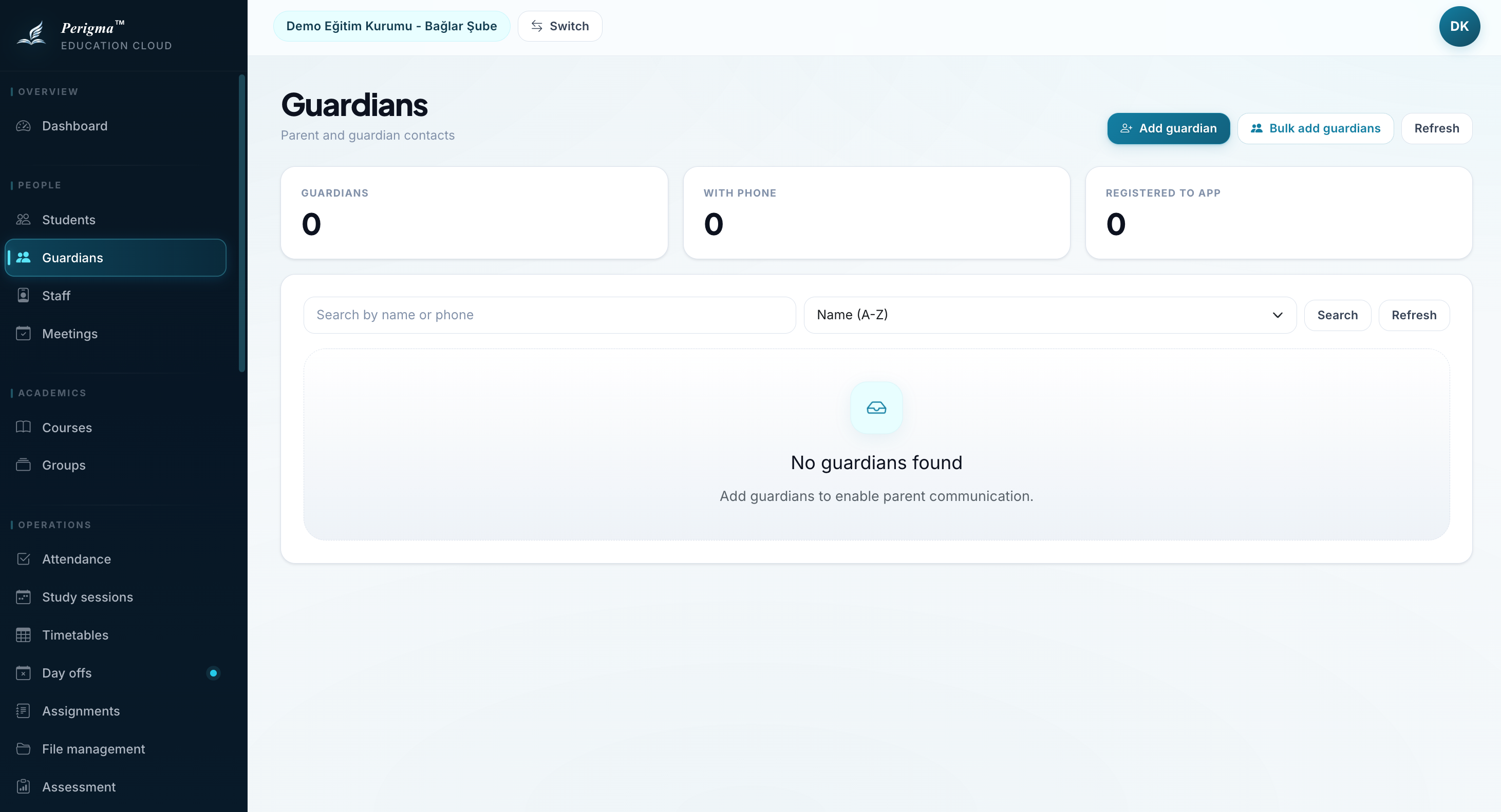
Image 5: Empty state example - "No records yet"
Loading Animation
While data is loading, skeleton placeholders are displayed.
Toast Messages
After actions, short status messages appear in a corner of the screen:
| Type | Color | Description |
|---|---|---|
| Info | Blue | General information |
| Success | Green | Action completed successfully |
| Warning | Yellow | Attention required |
| Error | Red | An error occurred |
Modal Dialogs
Some actions (delete confirmation, detail preview) open in modal dialogs. Use "Close" or "Cancel" to dismiss.
Search
Use the search field in the side menu or top bar to quickly find records.
Image 6: Global search bar and result list
Error States
If an error occurs, the page displays an error message and a "Try Again" button.
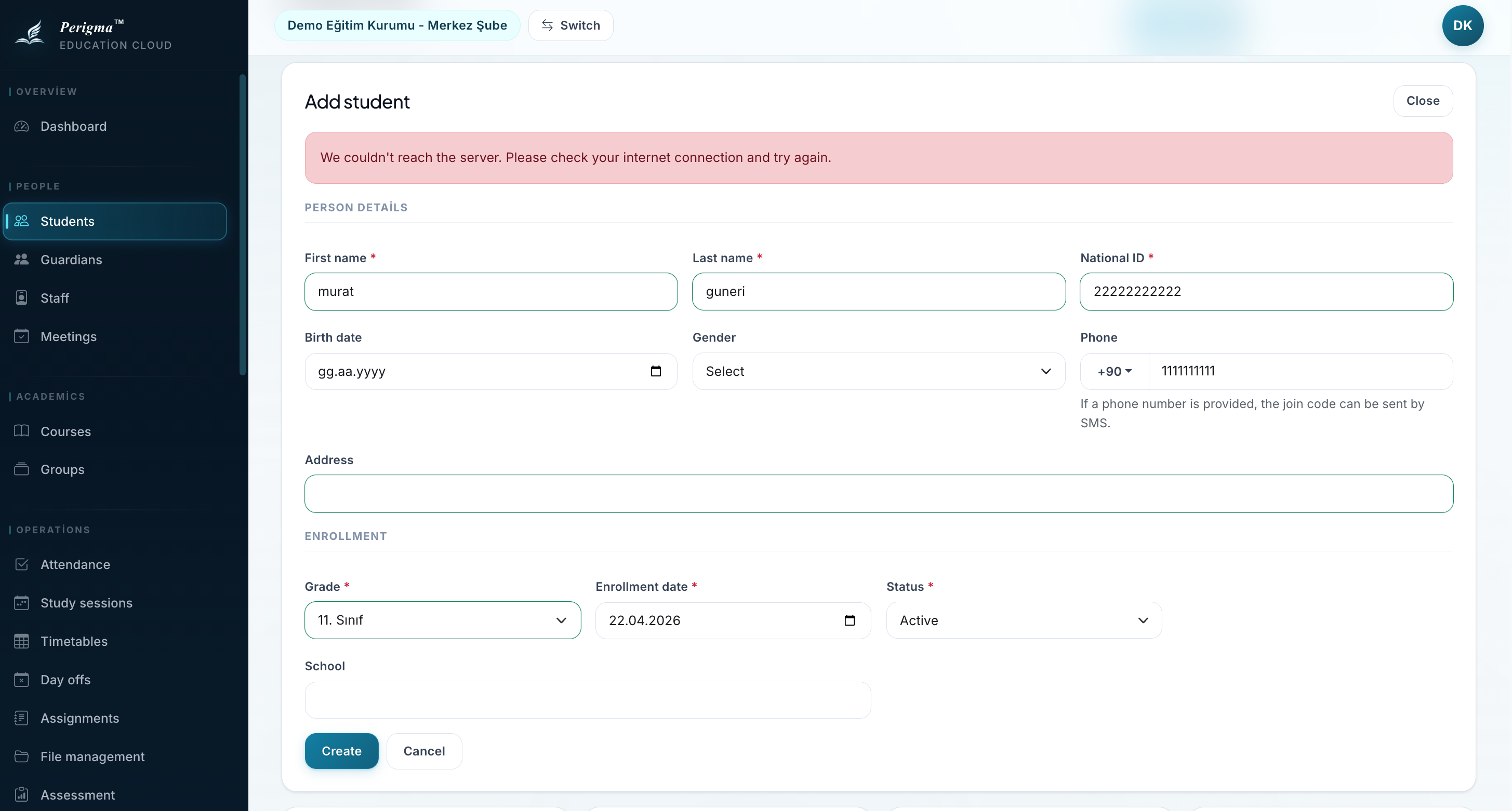
Image 7: Error state with "Try Again" button
Update Notification
When a new Perigma version is released, you may see update prompts:
- Recommended update: Optional update
- Required update: Must update to continue using the app
The web version (app.perigma.com) always serves the latest release; no manual update is needed.
Image 8: Required update prompt screen